


A generation or two ago, kitchens were routinely re-done in bright colours — and there's something in colourful kitchen design even today, suggests Giles Kime.
There was a publishing genre in the early 1980s that involved gathering a lot of women with impeccable taste and photographing aspects of their home to create books entitled The English Woman’s Kitchen/Bedroom/Garden, and so on. The rooms were blessed with a deeply reassuring quality derived from the fact that they had evolved over a few decades — and from their owners’ unshakable but unspoken belief in their own aesthetic instincts.
They had a distinctive, sometimes eccentric charm that you didn’t get in interiors magazines of the time, the focus of which tended to be polarised between a fixation with dried flowers at one extreme and the swaggy confections of interior designers at the other. The exception was my alma mater, The World of Interiors, that ploughed a lonely, but lovely furrow with a thrilling mix of faded palazzi, shabby châteaux and cutting-edge Modernism.
Forty years on, these books — also looking a little faded — are a reminder of a time when interiors were perhaps more devil-may-care than they are today. What is particularly remarkable is the considered use of colour, not in a way that was intended to shock the neighbours, or to keep abreast of trends, but simply as a source of simple pleasure, together with scrubbed-pine dressers and industrial quantities of French porcelain. It was bold injections of vibrant hues that gave their welcoming rooms a distinctive feel, particularly in kitchens, where jaunty table cloths and dressers in, say, Mediterranean blue or crimson, added significant joie de vivre.

Artichoke’s design here uses Little Green Light Gold No 53 to brighten things up.
There are cheering signs that colour is once again rearing its pretty head in the kitchen. Everhot, the Cotswolds-based manufacturer of range cookers has added a new Pillar-box Red to a rainbow of colours that already includes Mustard, Sage and Aubergine. None is driven by fashion, but is simply very pleasing.
Cabinetry is getting a similar treatment with bespoke kitchen specialist Tom Howley’s addition of two new colours to its range: a lovely, lovatty green called Serpentine and Dusky Pink.
Last year, Plain English entered the fray with a colourful collection that included a jewel-like Medlar Jelly and vibrant grassy Moygashel and Mouldy Plum. Although some of these new shades are vibrant, most have a subtlety that is unlikely to scare the horses. Most important, however, is that they create a kitchen that is very much your own.

How metal handles offer a beautiful finishing touch to a kitchen
Interiors editor Giles Kime gives his advice on how to get a handle on your kitchen drawers and cupboards.

Why the future of the kitchen-diner is more diner than kitchen
Giles Kime takes a look at the new breed of kitchens that could easily be mistaken for dining rooms.

The kitchen at Lundies House, blending practicality, beauty and history
Giles Kime takes a look at a kitchen design by Plain English in a 17th-century manse that is sympathetic to
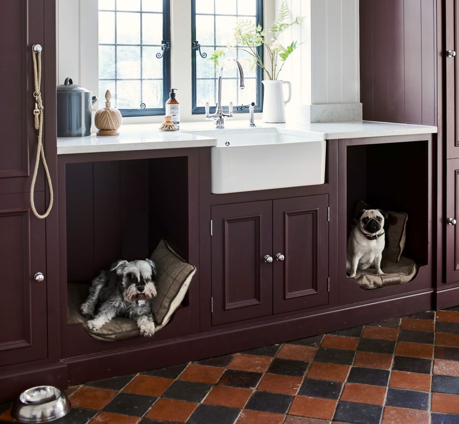
Canine cubbyholes: Dogs have taken over our homes — and now they’re taking over our kitchens too
Country Life's interiors editor Giles Kime on a bold new idea which bows to the inevitable and gives a pair


